November 14, 2022
This Week I Learned: 2022W45
Discuss this article on Hacker News.
Typescript
First time I have used TypeScript this week. I migrated this blog to it, and I have to say it was quite pleasant.
I really appreciated Generics, the fact that you can typehint the return of Promises and that interfaces can contain properties (and not just constants and functions as in PHP). It caught a few bugs I had in my code. I just experienced some issues with MDX because of some types. I fixed it without knowing how, really. I think it can bring a lot of value to projects, I just imagine it can become quite complicated sometimes to deal with types you don’t own, from third party libraries.
Anyway, a nice journey (especially for someone who’s not at ease with frontend)!
Fediverse
Not only there is Mastodon that is an alternative to Twitter, but I learned this week about Pixelfed (an Instagram-like) and Lemmy supposed to look like Reddit. I thought all these applications were each decentralized and federated in their own way, but they actually all use the ActivityPub protocol. Fascinating.
Cryptography - Security
I read this interesting article from Gitlab, stating they moved to the open protocol WebAuthn.
It allows a more secure MFA using either some biometric input (like fingerprint, face recognition) or a hardware key. The interesting thing I find here is that it verifies that the website asking for authentication is the real one, thanks to a public key.
CSS
The property mix-blend-mode allows to control how an element blends with its parent’s background. It’s quite impressive that we need less and less photoshopping to achieve some effects.
More about it on MDN. A quick use case on Twitter here.
Python
The min and max functions can take a key parameter which expects a function to do a custom comparison.
users = [
    {"name": "John", "age": 27},
    {"name": "Mary", "age": 32},
    {"name": "Mike", "age": 12},
]

min(users, key=lambda x: x['age']) # {'name': 'Mike', 'age': 12}
my_words = ['aaa', 'b', 'aaaaaaaaa', 'cccc']
max(my_words, key=len) # 'aaaaaaaaa'SolidJS
Solid Start, the NextJS-like framework for SolidJS is now in Beta. Maybe I’ll give it a try!
VSCode
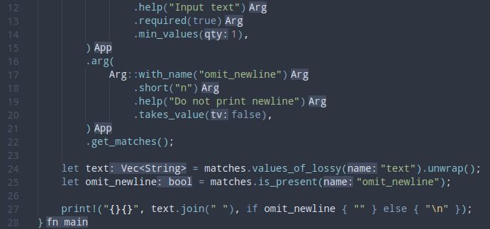
VS Code adds hints in your code to know the types of your variables, which is great. But I really dislike the color of it in most themes.
Here is how it looks with my Nord theme:

It’s confusing because it looks as important as real code. I found out today that you can control how these are displayed in your settings.json with those settings:
{
    ...
    "workbench.colorCustomizations": {
        "editorInlayHint.foreground": "#d5d5d5d6",
        "editorInlayHint.background": "#5660346b"
    },
    ...
}
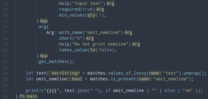
Here is how it looks after:

Git
When I created this blog I created a public/images directory to put the few images I wanted to use. Unfortunately I didn’t really think about it and I committed this folder.
I recently moved all my images to cloudinary and deleted the public/images folder. It was still in my git history though: they would take a lot of space for nothing forever.
I was wondering if there was a tool to fix this issue. I found out about this StackOverflow answer which suggests to use git filter-branch, which will apply a command (like an rm command) to each commit stage.
Of course it rewrites the whole git history so you should absolutely not use this if you work on a project with other developers. For me it worked like a charm.
TailwindCSS
In your tailwind.config.js, you can extend your theme and add a specific value you can then reuse in your HTML.
For example I wanted to have two different background images. I added this into my config file:
// ...
module.exports = {
  // ...
  theme: {
    extend: {
      backgroundImage: {
        'rss-light-mode': "url('...')",
        'rss-dark-mode': "url('...')",
      },
    },
  },
  // ...
};
Then I was able to use these two different background images (in light and dark modes) like this:
<div class="bg-rss-light-mode dark:bg-rss-dark-mode"></div>Viewport - Responsive Design
When I moved this blog to Astro (I will probably write a dedicated article soon on this!) I was surprised to see my website behave differently on mobile than it used to be with NextJS. Since I used the same TailwindCSS classes on both, I was really confused as to why it happened.
Fortunately, a great soul has helped me on Mastodon. I was missing the meta tag with viewport (more on MDN Docs here).
What is viewport? As explained in this short video, the viewport meta tag allows to tell the browser that the device’s width should be taken into account as the real width of the rendered page, on the contrary to websites that are not responsive and should be zoomed out on mobile.
Now the question is still: why this difference between Astro and NextJS? Why didn’t have to bother with this before?
The answer is simple: NextJS automatically adds a viewport tag in the HTML document. If you want to use your own custom viewport you can rely on this documentation page.
Discuss this article on Hacker News.